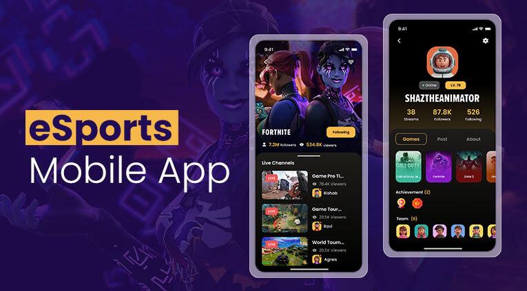
As technology advances, so too do the gaming industry and esports. Many mobile esports applications have emerged, allowing fans to analyse round statistics, team finances and match results in real time. However, during major tournaments, the issue of speed of access to information arises, as a delay of even one or two seconds or an awkward layout of interface elements can lead to the user switching to another app
According to DataReportal, by 2025, mobile traffic will account for over 60% of total internet traffic. This also means that most fans follow matches on their smartphones rather than on computers. That is why the design of dashboard solutions for iOS and Android has become one of the key areas of development for esports applications.
Why Do Mobile Esports Dashboards Need Different UX Approaches On iOS And Android?
Many companies try to create a universal interface for all platforms, but experience shows that this strategy does not always pay off. iOS and Android have different characteristics and standards, and users have different behavioural habits shaped by these features.
On iOS, users are accustomed to a minimalist interface, crisp animations and quick access to key functions via the bottom navigation bar. Android, on the other hand, allows for more customisation options and is often used on devices with different screen sizes. Because of this, the dashboard must adapt to a much wider range of usage scenarios.
This is precisely why major esports platforms pay particular attention to the structure of their mobile interfaces. For example, when following esports on the EGW gaming portal, you will notice the convenience of the navigation bar, quick access to tournament statistics, team news and current matches, without cluttering the screen with secondary elements. This approach is particularly useful during major events, such as the CS2 Major or Dota 2 The International, when a large number of matches are taking place simultaneously.
Liquipedia materials remain a useful reference point for UX designers, where the page structure is built around quick access to tournament information. Despite the web format, many principles of data organization are successfully applied in mobile applications.
How Can Real-Time Data Be Displayed Without Overloading The User Interface?
One of the most challenging tasks for esports dashboard designers is presenting information effectively. As statistical data can be voluminous, displaying it concisely on a page can be a difficult task. The most successful mobile solutions employ the principle of progressive information disclosure. The user initially sees only key metrics: the score, the timer and basic statistics. Additional data is revealed after interacting with a specific section.
A good example is the placement of basic information at the top of the screen, and detailed statistics open gradually. This approach is especially effective on smartphones with a diagonal of less than 6.5 inches.
During personal testing of several popular esports applications, an interesting pattern can be seen: applications that displayed all indicators at the same time required much more vertical scrolling. As a result, it is more difficult to find the necessary information than in products with a multi-level content structure.
Special attention should be paid to color indicators. For example, green for economic advantage or red for a series of defeats allows the user to assess the situation in just a second. Do not exclude the importance of the speed of updating information. The data should arrive in real time, but without excessive flickering of the interface.
Which Dashboard Components Increase User Retention In Esports Apps
Keeping users on the platform is one of the main objectives of the design. This is directly linked to how useful and user-friendly the information on the app’s home screen is. If a fan can find the information they need within a few seconds, the likelihood of them opening the app again increases significantly.
Experience shows that four categories of elements are of the greatest value:
Personalization plays a special role. If the user regularly watches Natus Vincere or Vitality matches, the system should automatically offer content related to these particular teams. In addition, interactive elements such as voting for the match MVP, predictions of results or personal ratings of watched matches can be useful.
What Design Practices Help Esports Applications Scale For Future Growth
Audience growth not only boosts revenue but also presents new challenges for mobile products. An interface that works well for 10,000 users may prove cumbersome once the audience expands to several hundred thousand.
The first step is to build a modular dashboard structure. Each block — statistics, news, calendar, results — should exist as a separate component. This allows new features to be added quickly without a complete redesign of the app.
Equally important is the use of adaptive meshes. In simple terms, the number of columns and indents should automatically change depending on the size of the screen. Thanks to this, the same program works equally comfortably on both Android devices and flagship iPhones.
The most successful esports applications in 2026 build UX not only for the current needs of the audience, but also taking into account new formats of design, content and ideas that may appear in the coming years.
Conclusion
UX/UI optimization in mobile esports applications is based on several key principles: a minimal number of steps required to access information, effective data visualisation, content personalisation, and a scalable interface architecture. It is these factors that determine whether a user will stay in the app after opening it for the first time and whether they will return during the next major tournament. In this article, we’ve told you everything about optimising mobile UX interfaces and control panels, so now you know what a high-quality esports app should look like.