Creating a mobile app that holds attention requires more than just a good idea. It depends on design choices that support clear navigation, fast performance, and user relevance.
When these elements work together, they create a focused experience, one that feels efficient rather than distracting. In a competitive market, this level of clarity is what sets strong apps apart.
Layout and Navigation
Layout decides how an app feels within seconds. It shapes movement, sets priorities, and removes hesitation. When the structure is clear, users move forward without effort. When it isn’t, they slow down or leave. Spacing, hierarchy, and grouping matter because they reduce friction and keep attention where it belongs.
Weather apps handle this well. Most of them place current conditions at the top, followed by forecasts and maps in a clear order. Users can check what they need at a glance and move on. Nothing competes for attention.
The importance of layout is also evident in the best betting apps. These platforms process large amounts of live data across many sports and markets. A clear structure allows users to move between pre-match options, live events, promotions, and account tools without confusion. When the layout is poor, speed becomes a problem. When it’s right, everything stays manageable.
Fitness apps follow the same logic. Users see progress immediately, understand where they stand, and know what to do next. That clarity keeps engagement steady over time.
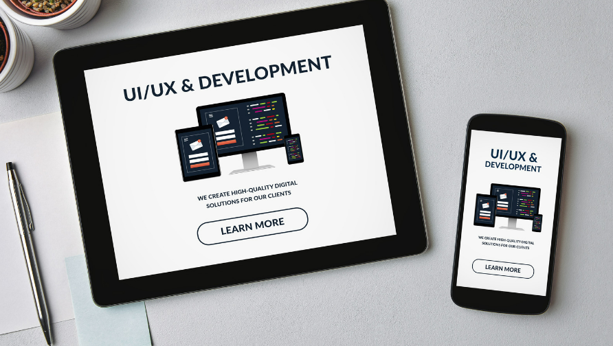
Intuitive User Interface Design
Users don’t think through each step; they act, and the app responds. Familiar patterns like swiping, tapping, or dragging work because they match habits people already know. The goal is to reduce friction so that movement through the app feels effortless from the start.
Google Maps shows this clearly. The search bar is where people expect it: top and centre. Directions update in real time. Voice guidance works without disruption. Each element stays in place while adjusting to the situation, whether you’re walking or driving.
Small details make a difference. Progress indicators during loading, clear icons, or smart button placement keep the flow intact. Banking apps like Chase Mobile avoid clutter by focusing on the essentials (balances, transfers, and bills), all reachable with a few taps. Fingerprint login adds speed and security without adding steps.
Personalization for Individual Needs
When an app adjusts to a person’s behaviour, it stops feeling generic. It becomes familiar, something built around the user, not the other way around. This kind of personalization relies on data, but its value depends on how subtly and respectfully it’s applied.
Etsy does this well. The app tracks what users browse, then shows similar handmade items without repeating the same suggestions. When favourites go on sale, or new matches appear, users get notified. It keeps the experience relevant and encourages return visits without being pushy.
Some personalization is based on place rather than preference. Uber recognises patterns (where you tend to go, what times you usually ride) and uses that information to simplify the process. Fewer steps mean faster results, and that consistency builds trust.
Performance and Speed Optimization
If an app feels slow, users don’t wait; they leave. Smooth performance has nothing to do with the app’s complexity. It’s about how quickly it reacts when someone taps, scrolls, or searches.
Netflix handles this well. Content loads in the background, playback begins instantly, and buffering is rare. That kind of reliability keeps people coming back without noticing what’s working behind the scenes.
Offline access is another part of good performance. Many apps store content locally so that users can keep writing or reading without an internet connection. Once the connection returns, everything syncs. The result is continuity, even when conditions aren’t ideal.
Accessibility Features
Design that works for everyone is essential. Features such as screen reader support, adjustable text size, and high-contrast visuals help more people use apps without extra effort.
Kindle sets a good example. The app includes voice narration, font controls, and background adjustments that make reading easier for users with different visual needs. It opens access to more readers, not by changing the content, but by making the interface adaptable.
Testing across a mix of users is what reveals what’s missing. Building with this mindset helps apps fit real lives.
Relevant and Useful Content
Content only holds attention if it stays relevant. It needs to be clear, timely, and aligned with what users expect to find. When updates slow down or the material stops adding value, engagement drops, often quickly.
Good content answers questions without making users dig. It adapts as needs change, whether that means reflecting new trends, shifting habits, or updated information. It should feel like a part of the product, not an afterthought. Clarity in format matters too. The structure should guide, not distract.
Most of all, it needs to earn trust. That happens when it’s consistent, accurate, and easy to navigate. When content stays sharp and relevant, people keep coming back because they know it won’t waste their time.