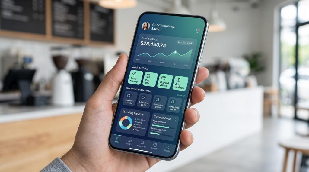
A great mobile experience is about more than attractive screens and clever interactions. It depends on how an app behaves when users move between networks, lose connectivity, travel to another country, or suddenly find themselves relying on slower mobile data. For designers and developers, connectivity should therefore be treated as part of the user experience rather than something that happens in the background.
Modern mobile products are increasingly expected to work wherever users are. Understanding technologies such as an eSIM can help creative teams think more carefully about the relationship between connectivity, accessibility, and mobile interaction. Holafly is one example of a service built around this changing approach to staying connected while using mobile devices.
Why Connectivity Belongs in the UX Conversation
When designing an app, teams often concentrate on navigation, typography, visual hierarchy, animations, and conversion flows. These elements matter, but the experience can still fail if the application assumes that the user has a fast and reliable connection at all times.
Imagine opening a travel application in an unfamiliar city. You need a map, booking confirmation, translation tool, or transportation information, but the network is weak. A beautifully designed interface does little if every important screen displays a loading indicator.
Connectivity affects:
This means connectivity should influence design decisions from the earliest stages of product development.
Designing for Real-World Network Conditions
A common mistake in mobile development is designing and testing primarily on fast Wi-Fi.
Real users operate under very different conditions. Someone might use an application from a busy railway station, a crowded event, a rural area, an underground transit system, or a foreign country. Network performance can change dramatically within minutes.
A resilient mobile product should anticipate those changes.
Instead of asking only, “What happens when the connection is fast?” designers should ask:
What happens when the connection becomes slow, unstable, or disappears completely?
That question can produce better experiences.
For example, an app can show meaningful loading states rather than blank screens. It can prioritize essential content before secondary imagery. It can save recently accessed information locally and allow users to continue certain tasks without an active connection.
These details may not appear in a design portfolio, but they can have a major impact on how users perceive the product.
Progressive Loading Makes Interfaces Feel Faster
Users do not necessarily need everything to load simultaneously.
Progressive loading allows an application to present the most important information first while secondary elements appear afterward. A product page, for example, might display the title, price, and primary action before loading high-resolution images and recommendations.
This approach has two advantages.
First, users can begin interacting sooner. Second, the interface communicates that something is happening rather than appearing frozen.
Designers can support this strategy through:
The goal is not simply to make an application technically faster. It is to make the experience feel responsive, even when the network is imperfect.
Offline UX Should Be Designed, Not Discovered
Offline behavior is often treated as a technical edge case. It should instead be considered a normal part of mobile product design.
Applications that depend on connectivity can provide useful offline functionality by storing appropriate information locally.
A travel application might keep saved reservations available. A note-taking application can allow users to write without a connection and synchronize later. A navigation application can provide previously downloaded maps.
The important question is not whether everything can work offline.
It is:
Which parts of the experience remain valuable when connectivity disappears?
Once that question is answered, designers and developers can identify the information that should be cached and the actions that can safely be performed without a network connection.
Make Network States Visible Without Creating Anxiety
Connectivity problems can be frustrating, but the interface should not make them worse.
Consider two different experiences.
In the first, an application simply stops responding. The user does not know whether the app is broken, the server is unavailable, or the phone has lost its connection.
In the second, the application communicates the situation clearly:
“You’re offline. Your saved content is still available.”
The second experience gives users context and control.
Good mobile UX therefore uses network states deliberately. Messages should be concise, understandable, and actionable where possible.
Instead of technical language such as “Request timeout: HTTP 408,” an application might say:
“We couldn’t load this page. Check your connection and try again.”
Simple language reduces confusion and keeps the user focused on completing the task.
Data Usage Is Also a UX Issue
Performance is not the only concern.
Mobile data can be limited or expensive depending on the user’s plan and location. An application that automatically downloads large videos, high-resolution photographs, or background updates can create unnecessary costs and frustration.
Creative teams should consider offering sensible controls.
For example:
These decisions show respect for the user’s resources.
International Users Need Different Assumptions
Mobile applications increasingly serve audiences across borders. That introduces another layer of UX complexity.
A user traveling internationally may have a different data plan, a different carrier, or a different level of network access than they have at home. They may also be using roaming services or a digital SIM rather than a traditional physical SIM.
For product teams, this means “mobile user” should not be treated as a single category.
International UX may require consideration of:
The more geographically diverse an application’s audience becomes, the more important these details are.
Connectivity Can Influence Visual Design
Connectivity considerations can even affect visual creativity.
Large background videos may look impressive on a flagship device connected to high-speed Wi-Fi, but they can become a liability on a slower connection.
Similarly, elaborate animations may consume processing resources or increase loading requirements without providing enough value to justify them.
This does not mean mobile design should become boring.
Instead, designers can focus on high-impact creativity with efficient implementation.
A small interaction that provides useful feedback can be more effective than a large animation that delays an important task.
Good creative direction is not about adding more elements. It is about choosing the elements that create the greatest value.
Build Mobile Experiences Around User Intent
One of the strongest principles in mobile UX is reducing unnecessary friction.
People frequently use smartphones while distracted, moving, multitasking, or under time pressure. They may be standing in a queue, walking through an unfamiliar location, waiting for transportation, or trying to complete a task with one hand.
The interface should accommodate those circumstances.
Important actions should be easy to identify. Forms should be short. Buttons should be appropriately sized. Content should be scannable. Error messages should explain what happened and what the user can do next.
Connectivity adds another dimension to this principle.
If a task requires a network request, the interface should make the waiting experience understandable. If the request fails, users should know whether they can retry, continue offline, or return later.
Test More Than the Happy Path
A polished prototype can look excellent during a presentation while hiding serious usability problems.
Testing should include realistic network scenarios.
Teams can evaluate the product under conditions such as:
Fast connection
This establishes the ideal experience and identifies baseline performance.
Slow connection
This reveals whether important interactions become frustrating when content takes longer to arrive.
Intermittent connection
This is particularly important for mobile applications because users can move between coverage areas.
No connection
This demonstrates which parts of the product remain useful and whether the interface communicates offline states effectively.
Network recovery
The application should also be tested when connectivity returns. Data synchronization, duplicate actions, and interrupted transactions can create unexpected problems.
Testing these scenarios early can prevent expensive redesigns later.
The Developer-Designer Connection
Connectivity-aware UX works best when designers and developers collaborate from the beginning.
A designer might create a perfect loading experience, while the developer knows that a particular API request can take several seconds under certain conditions. Discussing these limitations early allows the team to design a more realistic interaction.
Likewise, developers can identify opportunities for caching, background synchronization, and optimized assets that designers can incorporate into the experience.
The result is a product where visual design and technical performance support one another rather than competing.
A Practical Connectivity-First Design Checklist
Before launching a mobile application or mobile-first website, teams can ask:
Performance
Slow networks
- What does the user see while content loads?
- Can essential information appear before secondary content?
Offline
- What remains available without connectivity?
- Are saved items accessible?
- Does the interface clearly communicate offline status?
Errors
- Are network errors understandable?
- Can users retry failed actions?
- Is their work protected when a request fails?
Data usage
- Does the application consume unnecessary mobile data?
- Can users control large downloads?
International use
- Does the experience work for users traveling between countries?
- Are location, language, currency, and connectivity differences considered?
Accessibility
- Are important states communicated through more than color?
- Are buttons and interactive elements easy to use?
- Can users understand the interface under stressful or distracted conditions?
The Future of Mobile UX Is More Context-Aware
Mobile experiences are moving beyond the assumption that users are sitting still with a strong internet connection.
People expect applications to accompany them everywhere. That means mobile products need to understand context: location, connectivity, device capabilities, available bandwidth, and the user’s immediate goal.
For creative teams, this creates an opportunity.
Instead of designing only what an interface looks like, they can design how the entire experience behaves under different circumstances.
The strongest mobile experiences are not necessarily the ones with the most visual effects or the longest feature lists. They are the ones that continue to feel clear, responsive, and useful when real-world conditions become unpredictable.
Connectivity is therefore more than an infrastructure concern. It is part of the product experience itself.
When designers, developers, and product teams account for connectivity from the beginning, they can create mobile experiences that are not only attractive but also resilient, accessible, and genuinely useful wherever users happen to be.